On Thursday’s, The Werewolf participates in that time-honored tradition of judging a book by its cover – literally. I mean, let’s admit it, we all do it. And, as much as I’m in to audiobooks and eBooks, there’s nothing like having the real book in your hand, especially when it features particularly appealing artwork or design elements. And, while the recent Chip Kidd school is all fine and good, I’m a much bigger fan of the older, outmoded styles. I have to say that I fetishize book covers and so I present this feature where I cull Google images for the best cover art of whichever 3 or 4 books I happen to be reading that week. (Yes, 3 or 4 a week! Generally, a paperback at work for reading on the can, something from Audible on my iPod for when I’m doing mindless data entry or running, one CD book in the car from the library and usually even one more book for home.)
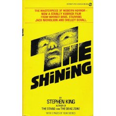
THE SHINING by Stephen King
As mentioned in Tuesday’s post, I’ve finally started in on this one and I am loving the hell out of it. When I started looking through cover images from years gone by, I eventually came to this one which happened to be the paperback my brother had lying around when I was a kid…
At the time I thought it was pretty lame and never picked it up – even though I loved the King back then perhaps more than I do now. But, as I look at this again this many years later I am gobstruck by the simple creepiness of the image. I even kind of remember that the silver of it did seem to really shine.
Now, as a rule, I pretty much hate any book cover that uses images from its movie adaptation. This other Shining cover doesn’t really break that rule, but instead uses one of the brilliant posters from the movie’s original release. I suppose it’s sort of cheating to call this a book cover since it was a poster first, but I can’t help it. If I saw this on the used book shelf I’d snatch it right up…
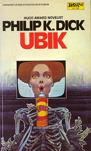
UBIK by Philip K. Dick
My Audible subscription has me finally getting into the utterly singular sci-fi madness of Mr. Dick. I meant to read his stuff chronologically after I first listened to “Man in the High Castle,” but I had to ditch that plan in favor of what was readily available. So, I’ve ended up at the far end of his career instead, deep in the middle of his Gnostic-inspired, bat-shit crazy, toothache fiction.
The stuff in this book lends itself to a million covers, but I imagine it’s hard to boil down to a single image. The two I’ve picked aren’t necessarily the best, but they illustrate two wildly different approaches to making a cover for this book.
This first one captures the fact that it’s a very, very funny book and also supremely weird…
And, this Japanese edition cover takes the more serious, lonely approach which is still just as appropriate despite how wacky the novel really is…
Both covers get major kudos for breaking the mostly ironclad law of publishing which apparently says “NO PHILIP K. DICK BOOK SHALL BE RELEASED WITHOUT MENTIONING BLADE RUNNER ON THE COVER!” (I suppose a Japanese reader can tell me if I’m actually right about that.)
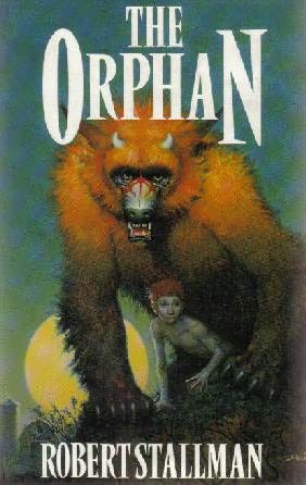
THE ORPHAN by Robert Stallman
The cover I’ve chosen for this brilliant werewolf novel happens to be the only image I could find online as well as the exact cover that’s on my paperback. I don’t believe this book has seen much print, which is a shame. And, when I first saw this cover I thought it was a little lame. The wolf seemed to be too overdone and the boy too Tolkeinish. But, every time I end a chapter and look back at the cover I can’t help but be drawn to the image. Now I think it’s pretty much damn well perfect…
HEART SHAPED BOX by Joe Hill
Just about finished with this book and have to say that it hasn’t really lived up to the hype I’d read prior to it. It’s a good yarn with interesting characters and Joe Hill’s definitely worth keeping on the radar going forward, but mostly I’ve just found it to be slightly better than okay. And, appropriately, the covers are mostly just “okay” too. I’ve chosen this one because it stands out a little better than the other few that I’ve seen, but I don’t necessarily like it any more than any of those.
I do find it interesting that the image in the top right corner of the woman with the eyes scratched out was not visualized as it is in the book, with dark black nests of lines squiggling over the eyes of the dead. In fact, the cover artist might have used that singular image idea as a central theme instead. That or just the hanging, half-moon razor blade on a chain the dead man uses.
I do like the dogs, though.
Tags: Audible, Blade Runner, Heart-Shaped Box, Joe Hill, Man in the High Castle, Philip K. Dick, Robert Stallman, Stephen King, The Orphan, The Shining, Ubik


Leave a comment